• Home
  • Blog
  • About
  • Research
    • Publications
    • GitHub
    • Presentations
    • Videos
    • In the News
  • Contact Me
  • Other Fun Stuff
    • Flash Mob
    • Curryosities
    • Experiment.com
My Life is Crap

Where?

2/25/2014

0 Comments

 
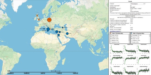
Do you know about your recent genealogical history and want to find out more?  Oxford University recently released an interactive map illustrating the genetic histories of 95 different populations across the world. Aside from being of ample means for procrastination, the map shows the genetic impacts of European colonialism, slave trade and mixing of races along trade routes between the East and West.

Clicking on each location shows you the genetic admixture of the region (how genes from the various regions have mixed and mingled – admixture is the result of two or more populations interbreeding and introducing novel genetic lineages into the population).  For example, I am Irish and Albanian (two of the known countries in the mutt-mixture that makes up my family).  If I click on Ireland, there is no strong admixture (they obviously didn’t sample any Vikings) but if you click on Greek (which I assume includes Albania, as they are Greece’s Mediterranean neighbor to the north) they found there to be admixture dating back to between 718CE-1138CE which they are deeming as Polish-like (Polish, English, Scottish, etc.) and Cypriot-like (Cypriot, Jordanian, Syrian, etc.).  So, if you dig deep enough, I very well could have some Middle Eastern ancestry. Assume that my ancestors have some of the Cypriot admixture.  Egyptian-like admixture into the Cypriot population dates back to 662CE bringing in genetic lineages from Africa.  But if my ancestors were rocking the Polish admixture, then it all inevitably comes full circle with the Irish bumping ugliest with the Spanish around 234BCE then mixing with the Sardinians around 634CE who were then in cahoots with the Polish around 1054CE and then moved on to the Greeks.

Picture
Go to http://admixturemap.paintmychromosomes.com/ and play around a bit.  See if you can find the traces of European colonialism they speak of.  See if your ancestors have some smidgen of some population from a country you've always wanted to go to.  Or just click buttons and look at the pretty pie charts.  The world starts to look like a smaller place when you can visualize how populations have interacted over thousands of years.

If you want to learn more about how they went about creating this map, read their article in Science:
  • G. Hellenthal, G. B. J. Busby, G. Band, J. F. Wilson, C. Capelli, D. Falush, S. Myers. A Genetic Atlas of Human Admixture History. Science, 2014; 343 (6172): 747 DOI: 10.1126/science.1243518
0 Comments


Leave a Reply.

© Caitlin Curry All Rights Reserved
  • Home
  • Blog
  • About
  • Research
    • Publications
    • GitHub
    • Presentations
    • Videos
    • In the News
  • Contact Me
  • Other Fun Stuff
    • Flash Mob
    • Curryosities
    • Experiment.com